Mazzucchelli

Even when he was working in the mainstream, working right in the centre of the Marvel Universe, drawing a book featuring the holy trinity at the centre of the Classic Avengers line-up, even then, he never felt like a mainstream artist. There was always something different about his work, something which meant that he never quite fit in. He was almost too good. His storytelling was absolutely seamless, flowing and perfectly paced, his layouts brilliant. His art always seemed more observational than any of his peers. When he drew a man sitting in a room, it looked like a man sitting in a room. He never seemed out of his depth drawing the mundane or realist scenes even Superhero books occasionally demand from their artists. Many artists always seem like they want to be drawing men fighting, muscles flexing, mouths open. Not David Mazzucchelli. But when he did draw a fight, he made it look real. His figures moved like people, they had weight and correct proportion, and that combined with his ability with framing and storytelling makes his action scenes more visceral than a thousand identikit scenes from genre hacks. His obvious joy in depicting the figure in motion means that these scenes are often beautiful, too. Observe these panels from Batman: Year One:

But Mazzucchelli could draw anything and make it look beautiful. His line changed over the course of a career that took him from his early Marvel work, which seemed distinguished only by that excellent grasp of anatomy, to his later independent work, which he wrote as well as drew. The Marvel material obeys the house style of the era to a certain extent - that anonymous competence that disfigured hundreds of Shooter-era Marvel comics and meant that the genuine talents were too often encouraged to seek employment elsewhere is aped by Mazzucchelli, but there are flashes, even in that early work, of a different, rare sort of talent. That talent began to emerge while Denny O'Neil was writing "Daredevil" and Mazzucchelli was inking his own pencils. His inking allowed him to indulge himself, and so the line became a little sloppier and more expressive, the work more distinctive and original.
He made a breakthough with the arrival of Frank Miller as writer on "Daredevil" and one of the greatest - if most short-lived - writer-artist teams of the modern era was born. Miller had announced his own talent with his work as Writer-artist on "Daredevil" years before, redefining and energising the character during his run. He surpassed that work when he wrote "Born Again" for Mazzucchelli to draw. Mazzucchelli pushed his art and it became looser and took more risks, in terms of design and linework. The sequence where he renders Ben Urich's face as a steadily sharpening little caricature to express his constricting terror is fantastic. The many splashes are all beautiful:


And when Miller finally allows the narrative to explode in the final few issues, Mazzucchelli gets to draw Captain America and Thor and Iron Man, and Daredevil fighting the kind of city block-levelling battle so familiar from the superhero genre, and he does it without losing himself. He maintains that realism and doesn't sacrifice any of his coherence to spectacle. That scene is also one of the rare instances when Marvel characters are afforded the same kind of tonal treatment DC's big icons routinely receive. DC books often look at Superman, Wonder Woman and Batman as if they are gods - seen from below, by the mortals. But the Marvel Universe is more down and dirty, more informal in its hierarchy (its most famous Icon is the far more "street", indeed "friendly neighbourhood"- Spiderman) and so the big Marvel characters are rarely seen from ground level. But they are in that scene from "Born Again", as we see them the way Ben Urich does. Miller's narration sums up Captain America thusly: "A Soldier with a voice that could command a God--and does." Mazzucchelli's awed shot of a silhouetted Thor, hammer aloft as lightning shatters the sky behind him, gives that character a gravitas and sense of awe too often denied him by his treatment in the Marvel universe (where he generally comes across like a smack-talking wrestler). Iron Man, standing in the rain before a flaming helicopter, raises his hand towards Daredevil, and Miller describes the power of his armour in one panel : "Theres a soft hum as computer circuitry generates enough power to level a building-- and holds it, waiting." Its a great scene, enhanced by the sense of writer and artist in the middle of an exciting, intuitive collaboration.
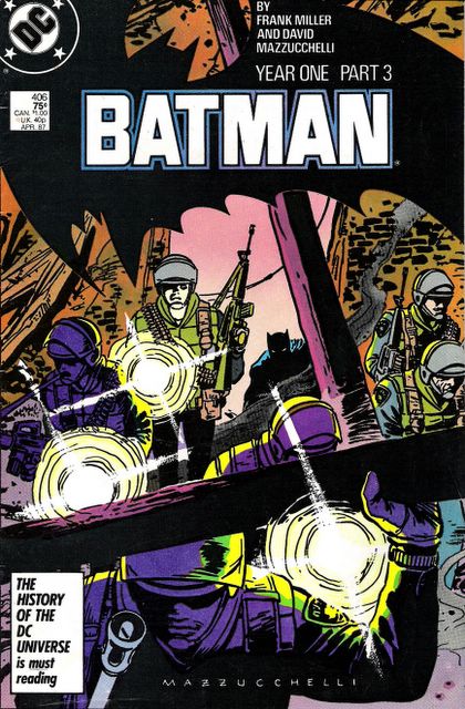
If "Born Again" is the best Daredevil story ever (and it is), then Miller and Mazzucchelli next tackled a bigger, more iconic character, and created what is arguably the greatest story in his long history, too. "Batman: Year One" came out not as a special, prestige format miniseries, as "The Dark Knight Returns" had, but was a continuing storyline in "Batman", the monthly DC series. But it was a radical departure from anything ever seen in that comic before, both in narrative and visual style.

Here Miller used the device he had perfected on "Dark Knight Returns" of multiple narrators. Hence we see Gotham from the points of view of two characters, Lt. Jim Gordon, transferring into a famously corrupt, troubled Police force, and Bruce Wayne, returning from his years of wandering the globe training for his personal war on crime. "Year One" is barely a superhero story at all. We only see Batman in costume for a page or two over the first two issues, and Gordon is as much the protagonist as Wayne. This plays to Mazzucchelli's strengths - most of the scenes take place in the "real world", concerned with real people, and his Gotham is a seedy, dirty, crumbling Noir City, filled with shabby characters. Colourist Richmond Lewis finds a beautiful pallete to do justice to Mazzucchelli's work (one weakness of "Born Again" is the tendency of the simple colouring techniques to cheapen the sophistication of the actual linework beneath), and it is a sombre and dark one. Where there are unexpected splashes of colour, they work perfectly. Again, Miller delays unleashing the narrative, but when he does, Batman is cornered in a tenement by a murderous SWAT unit, and Mazzucchelli shows again what a fantastic action artist he is:
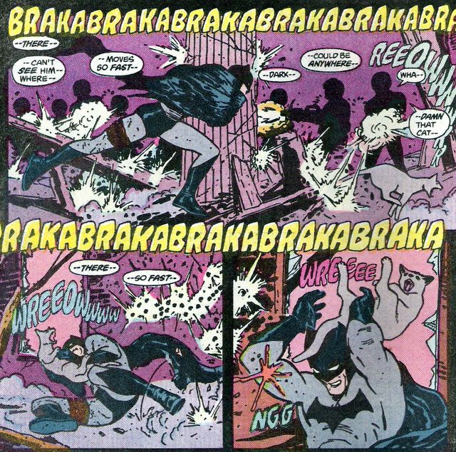
His linework was getting progressively rougher and more minimalist at this stage, without compromising the beauty or integrity of his work. Indeed, it was getting more and more beautiful in its simplicity as it seemed less and less at home in the mainstream. No other artist - at that time - would dare draw a Batman as roughly as this, with so few lines:
Thats an image reminiscent of Alex Toth, which is the highest praise I can muster. Mazzucchelli's use of shadow and silhouette in "Year One" is also truly masterly, and his brilliant design sense has never been better evinced than in the series' covers:

Reading it now, "Year One" stands up brilliantly, far better than "The Dark Knight Returns", with which it shares many characteristics. But "Year One" is less pretentious and far tighter than its older brother. Its probably the best thing Miller ever wrote, and the peak of Mazzucchelli's art for the mainstream superhero field. In his afterword (in the form of a comic essay) for the 20th Anniversary edition he discusses the differences between the two works - the "fortissimo, operatic" Dark Knight
in contrast to the more "mundane" and "credible" Year One, "grounded in a world we recognize". That edition also includes lots of his preparatory sketches, thumbnails, paintings, promotional illustrations and comparisons between colour and black & white versions of his pages, all of which only shows what a great artist he is.
Its the combination of factors that makes his art so outstanding. He had the goods in every department: line, storytelling, composition, layout, pacing, design...many comic artists make good careers on the basis of competence in one or two of those areas, but Mazzucchelli was brilliant in each of them. After "Year One", he more or less turned his back on mainstream comics, and followed his muse, editing, writing and drawing what would be published in the three annual issues of "Rubber Blanket" from 1991 - 1993. These stories were more personal and experimental than anything he had illustrated as an artist before. In the third issue he unveiled what I think is probably his masterpiece, a two-colour, 40 page fable called "Big Man".
Rendered beautfully with a brush, "Big Man" tells the story of an isolated farming community which discovers a giant tied to a raft washed up upon their local beach. They take him in and he becomes almost a part of a local family before tragedy strikes, as it inevitably must.


The first time I read "Big Man" was in a bookshop in Paris, in French. My French is not good. C'est merde. But it didn't matter, because Mazzucchelli tells this story so simply and with such strong visual instincts that it was all utterly comprehensible. What little dialogue there is generally I understood, and what I did not understand did not prevent my understanding of the wider narrative. Much of it is utterly wordless - pure visual storytelling, with quite masterful use of the two tones. Long stretches are captivating without any dialogue, such as the scenes of the Big Man helping the men to farm and the scene where he lifts a tractor off an injured farmer. The rough line afforded by the brush is perfectly suited to the simple nature of the story and the archetypes and morals Mazzucchelli is dealing with, and his art seems more expressive, more emotional due to this thcker line he has adopted. The story can be seen as a reading of the "Hulk" story but it feels almost like a fairytale in its simplicity and beauty. It is, finally, very moving.
After that third issue, he worked on an adaptation of Paul Auster's novel "City of Glass" with Paul Karasik. It features his mature style at its cleanest and clearest, its most intellectually bold, in response to the artsiness and tricks of Auster's narrative. But all the qualities evident back in his Marvel work are still there, and its a lovely piece of work. Since then he has contributed stories to Drawn & Quarterly anthologies (including the brilliant "Rates of Exchange" in 1994) and illustrations to the New Yorker. He teaches in New York, and is reportedly working on a new graphic novel. Its a comforting thought, that there is more work to come from him. The artform cannot really spare somebody with his talent.
Labels: comics
posted by David N at 11:59 pm
![]()


10 Comments:
I remember reading year one and thinking that the artwork felt like a throwback to older comics, back to the original heyday...like it was supposed to be a tribute to the origins, to look dated and from that time.
This probably shows how few comics I've read, that I didn't know one other thing Mazzucchelli had drawn.
There is no wireless router here. I am in the sticks.
Well, it does evoke lots of classic artits, but I don't know how deliberate that is.
Dial up, then? Seems ridiculously slow after broadband, doesn't it?
The panel where he interrupts the diners; "You have eaten well." That page is one of the best layouts I've ever seen.
And I've already raved to you about the Daredevil/Vulture fight INSIDE a building. Awesome stuff.
Just catching up on summer blog reading. I too have raved with you about Mazzucchelli, at least online if not in person.
I realise I've never read that "City Of Glass" at all and I'm totally missing one Rubber Blanket, though not the one with Big Man.
Have you read his Angel story from Marvel Fanfare (I think)? That's my other favourite thing of his after Year One. Not the greatest story in the world but utterly gorgeous and a similarly unique (for the time at least) take on an established character.
Damn your comic posts for sending me to dig in boxes every time...
Oh and I also want to say that Year One is better than Toth. It almost makes me feel he could turn his hand to any style and best the style's master, if he cared to. Kyle Baker is on that level too but really isn't bothered to do it. Mazzucchelli's work is so precious. We were talking about how little Scienkiewicz there is but Mazzucchelli has produced only a fraction of that.
I wish someone would recolour Born Again. I found the issues to see if the original colours were better than the book (as is normally the case) and to be honest they still weren't much cop.
Year One is definitely in my top 3 comics stories/books. The other two would be Black & White by Taiyo Matsumoto (back in print in one volume, 5 pounds off at Gosh apparently, ahem) and Lone Wolf & Cub.
Every time they rerelease year one I want to buy it again.
I agree about Toth. I appreciate Mazzucchelli more and more as I get older, which isn't the case with most comic art. Most art, actually. But I see more in the simplicity of his stuff every time I come back to it.
I had to buy that Year One rerelease just coz it looked so beautiful, I couldn't resist. And yeah, I've got that Fanfare Angel story somewhere. Written by Ann Nocenti, wasn't it? Creative team made in heaven, I think.
I bought the "Big Man" Rubber Blanket off of amazon a while ago, and it's Mazzucchelli himself who is selling it - his name and signature was on the postal stuff on the wrapping. Which gave me a ridiculous thrill, I can tell you..
Going to Amazon...
Whole lot of love going on here! I'd read your JRJR post a while back but I'm a genuine lurker generally.
Love love love year one. Better than Toth...that Beezer B! Year one was re-coloured by Richmond Lewis for the different paperstock. If you check out the seen at Batman's parents' graves, in one version it's not coloured, for example.
Year One is a comic I'd love to have been around for as it was coming out. I don't thionk there's a better comic for me or another that I involuntarily read every time I pick it up. Here in Spain when the latest movie came out they were selling it for a Euro as a start of a run of reprints. And what do you follow Year One with? Why Year Two, of course, then Knightfall...
All this talk of Baker and Mazuchelli gets me thinking top ten time...I'll get thinking.
Mazuchelli's supposedly working on a 300 page graphic novel.
Well, lurking is good but comments are better.
That 300 page GN better be good to justify a wait this long....
BIG MAN will always be a classic in my eyes! I remember when I bought that issue of "Rubber Blanket" and went through that story! Wow! Not much more I need to say. He is an amazing talent. BIG MAN also reminded me of an Alex Toth draw story called "Daddy and the Pie"
Check this outhttp://www.metabunker.dk/?p=690
The Child and the Giant - On Alex Toth and David Mazzucchelli
Great blog and keep up the fun work.
Post a Comment
<< Home